Entries Tagged 'Playing House' ↓
February 25th, 2010 — Playing House

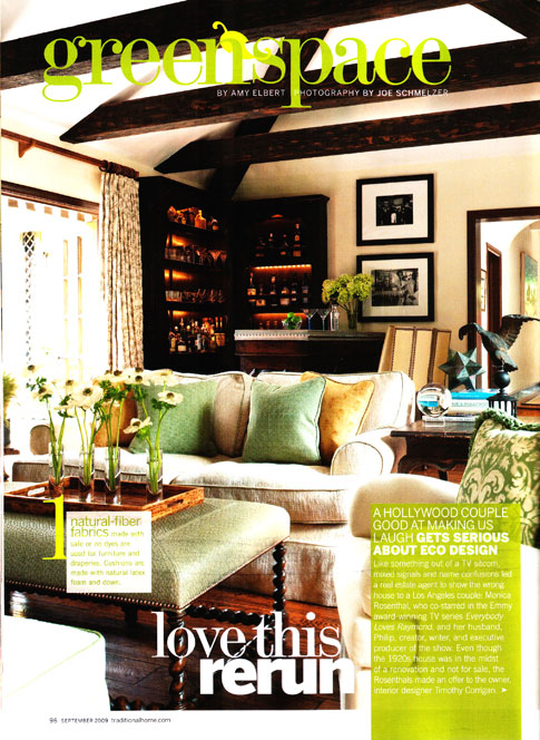
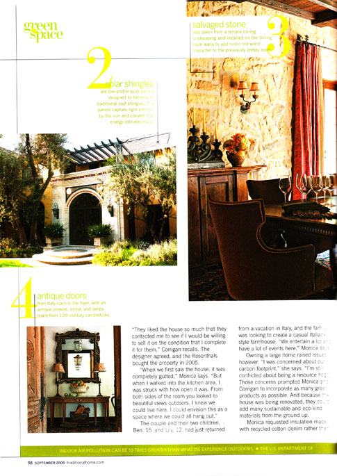
1. Natural fiber fabrics made with safe or no dyes are used for furniture and draperies. Cushions are made with natural latex foam and down.

2. Solar shingles are low profile panels designed to blend with traditional roof shingles. The panels capture light emitted by the sun and convert that energy into electricity.
3. Salvaged stone was taken from a terrace during landscaping and installed on the dinning room walls to add rustic old world character to a previously dressy room.
4. Antique Doors from Italy open to the foyer, with an antique console, mirror and lamps made from 19th century candlesticks.
Continue reading →
January 21st, 2010 — Playing House


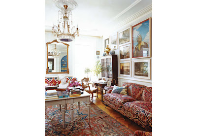
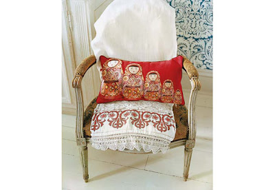
There’s history, there’s fantasy, and there’s an enchanted world that hovers somewhere between the two. On a rainy fall day in Brooklyn Heights, the front door of a town house opens to reveal an entrance hall giving onto a large, well-proportioned living room, its tall windows overlooking the neighborhood’s leafy backyards; rousing Russian music playing on the sound system; a fire crackling in the grate; and an elegant oval table set for lunch, with a bottle of champagne already opened in an ice bucket. The room is furnished with eighteenth-century slipper chairs, sofas, and bergères; the walls are hung with Russian paintings, drawings, and porcelain; and on several surfaces, stately samovars stand at attention.
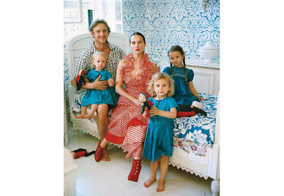
No, you have not stepped into a White Russian salon 150 years ago, but you may as well have. This is the domain of Olya Thompson, née Yakovleva, a Muscovite textile designer and former dancer often sighted around town in beautiful, ethereal outfits, with her equally romantic-looking husband, Charles, a photographer, and sometimes an exquisite toddler or two. (The couple have three daughters and a newborn son.) For the past three years they have lovingly restored and furnished this house, ripping out Sheetrock, repairing plaster, opening up bricked-in windows, and scouring auctions, antiques stores, and flea markets from Paris to Moscow to Connecticut to create a richly textured family home of unusual elegance. Only the occasional touch of modernity—bright flashes of color, a few contemporary artworks, red and blue Stokke high chairs glimpsed around the kitchen table—reminds you of your bearings in space and time. – Vogue


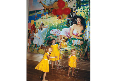
Images Coutsey of Vogue
December 18th, 2009 — Playing House
 Take a serene Santa Barbara setting with to-die-for interiors, add a triangle mixing love, divorce, and renovation, and you have all the elements of an unusual romantic comedy.
In theaters on Christmas Day, the sophisticated yet relaxed California-style interiors in Universal’s upcoming film It’s Complicated will vie for attention with a star-studded cast–Meryl Streep, Steve Martin (both seen here), and Alec Baldwin. The comedy weaves the tale of a divorced mother of three and bakery owner (Streep, as Jane) involved romantically with both her ex-husband (Baldwin) and the architect (Martin) helping in her kitchen renovation.
Written and directed by Nancy Meyers (who has given us such design-rich films as Something’s Gotta Give and The Holiday), It’s Complicated is reminiscent of the classic Hepburn-Tracy comedies of the ’50s (think Desk Set). In true Meyers fashion, it features a strong female lead, snappy dialogue, a memorable sound track, and trend-setting interiors.
Besides being a master with pen and camera lens, Meyers is a dedicated design devotee as well. From the Hamptons beach house of Erica Barry (Diane Keaton) in Something’s Gotta Give to the Wallace Neff bungalow in The Holiday, with Amanda Wood (Cameron Diaz), Meyers’s imprint is seen in every club chair, paint color, and light fixture. Apparently it’s in the genes–Meyers’s mother was a designer who worked well into her 80s.
As in all her movies, the house as character plays a major role in the latest Meyers film. After a decade as a divorcée and now facing an impending empty nest, Streep’s Jane decides to redecorate her 1920s Spanish-style ranch.
“Since more than half of the movie takes place in the house, we really get to know the place,” says Meyers. “What the characters wear and how they live and decorate really say something about them.”
The film reunites (for the fourth time) the director with production designer Jon Hutman. “My job is to try to understand and interpret Nancy’s vision,” says Hutman. “What I do, with strong and special guidance from Nancy, is make the sets real, striking something in people.”
Working with set decorator Beth Rubino (who decorated the interiors of the much-admired beach house of Something’s Gotta Give), Hutman designed the sets with a key component in mind–storytelling. “I like the sets to look the way they feel to the character,” he says.
The overall design direction came directly from Meyers, who wanted a “Belgian look that is reflected in the house’s furnishings and a quiet palette with natural linen.”
Hutman’s interiors reflect a sophisticated influence mixed with California casual. “Whether in the Hamptons or Santa Barbara, the world of Nancy’s movies is one of casual elegance and not just a fancy way of life,” he says.
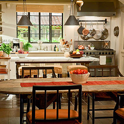
Meyers also took her design cues from the color of the rooftops of the idyllic coastal town of Santa Barbara. “What I like about Santa Barbara is the rich color that saturates your vision at every turn,” she says. From cashmere throws and chair upholstery to a bowl of fruit on the dining table, the color orange (think of the orange/brown color of an Hermès box) is used as an accent throughout the film. The decor had to accent Streep’s fair complexion as well, so Meyers used “creams and beiges that would capture the beauty of her skin.”
Rubino mixed high-end furnishings–Calvin Fabrics and Dessin Fournir and George Smith furniture–with antiques from 1st Dibs and items from West Elm. “My goal was to capture the essence of Meryl’s character as someone who dances to the beat of her own drum, ” she explains.
The open kitchen that receives a makeover in the movie plays a pivotal role. “The kitchen has individual style,” notes Hutman. “It’s makeshift and funky.”
Hutman and Rubino studied Tuscan, California, and French kitchens to arrive at the finished product–a functional room that reflected Jane’s tastes as well as her budget.
Ever the method actress, Streep inhabits both character and space when making a movie. The Academy Award-winning actress advised Meyers to reduce the size of the kitchen and add water damage to the ceiling for a touch of realism. “Meryl got involved very early in the process,” says Hutman. “She had special ideas on who the character was, how she lived, etc.”
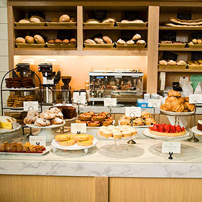
The sets also included a bakery that was influenced by everything from London’s Daylesford Organic to New York’s City Bakery and Dean & Deluca, among others.
Even the nuances of bread display became a factor–the design team worked closely with Martha Stewart alum, Julie & Julia food stylist, and cookbook author Susan Spungen on the details.
Unfortunately, Meyers’ next production will never be seen on film. She is building her own house with the help of her long-time interior designer and film collaborator James Radin (whose California design aesthetic can be seen on Meyers’s past three films). A true design aficionada (she admits to following the design blogs), Meyers looked at hundreds of images for the film’s interiors, and plans to purchase some of the set decor for her own house.
she’s an independent career woman and mother who is building a house, she appears to have much in common with her main character. (One exception–she is not involved with her architect!)
This designing director clearly writes what she knows.
– Article and Photo From Traditional Home


Art by: Mitchell Johnson


Art by: Mitchell Johnson

Art by: Mitchell Johnson
October 30th, 2009 — Playing House


Martha Stewart’s home Kitchen Equipped with Everything you Need!
October 7th, 2009 — Playing House

